Style an image with CSS
I wrote this post a while back. The content can still be relevant but the information I've linked to may not be available.
Want to get that ‘real photo’ effect on your images? You know, the one that looks like a holiday snap with its white border.
Well, you can create each image in Fireworks/Photoshop and add these to your website – but you can also do it with CSS by creating a style that gives you the snapshot look. This may save time when when you want to change the effect – perhaps increase the border width or change the border colour? That’s easy to do with a style sheet but if you have many images would be time-consuming with Fireworks/Photoshop.
Firstly code image like this:
<img src="yourimage.jpg" width="250" height="188" class="photo" />
Here, I have used ‘photo’ but you can use whatever you want. The image dimensions should be specific to your image, of course. [Don’t forget to add an “alt” tag as well]
Set up the style in your stylesheet like this.
.photo { border: 1px solid #CCC;

    background-color: #FFF;

    padding: 5px;

    float: left;

    }
In this case we use a padding of 5px and a white background to get the white ‘photo paper’ effect. A 1px grey ‘outer’ border is added as well. We think it works best by floating the
left. There’s no need to give the
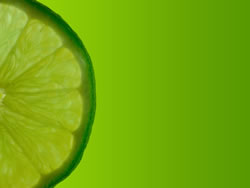
That’s it! Here’s the final effect:
You can also give the .photo class values for its top/left/bottom/right margins if you want to adjust the image position. In fact, that what we have done here.
Another option is to use different colour values for the top/left borders which can give a slightly 3D effect.
» View actual image used.
Try different things to get the effect you want!
Comments are OFF for this post.