Website inspiration: Colour and coffee
I wrote this post a while back. The content can still be relevant but the information I've linked to may not be available.
I collect website screen shots in a Flickr set called Website Inspiration. I use the screen shots to remind myself of some fantastic website designs that I see on my travels round the web. Each design has aspects that I love, for example the colour scheme, the typography, or even one specific element that I think works really well. I have never really featured the websites or screen shots on this blog in any detail so this is the first of what I hope will be a series of regular posts that highlights some outstanding website designs. Up this week are Rainbeau Mars and Art in My Coffee
Rainbeau Mars
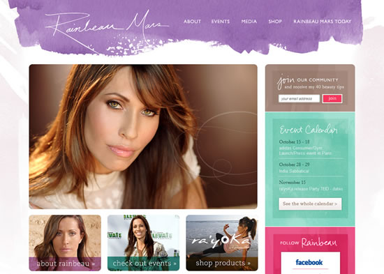
Website by fluidesign
What I love about this design for Rainbeau Mars is the pastel colour scheme which is driven by the purple, watercolour paint effect of the header. The watercolour splash is in contrast to rest of the page which is comprised of carefully arranged content, with some rounded corners, and a large slideshow image that dominates the page. I also like the semi-transparent captions on the smaller images.
Art in My Coffee
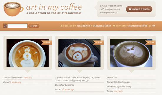
Website by Meagan Fisher
Art in My Coffee is a beautiful mixture of brown, coffee-related colours, together with some subtle line shadow/depth effects. I also like the rounded corner borders, and their bottom arrow, for the images. The main content is organised into a three-column grid which really suits the website’s purpose. The logo has a cool hover effect as well. I love this design! And there are some great examples of coffee art featured!
These two are great website designs…
Comments
05 Jan 2010 09:11:34
These are two outstanding examples of web 2.0 designs that encompass a great choice of colour schemes and features. Of the two I particularly like ‘Art In My Coffee’, with its subtle usage of browns and imagery.
I like the usage of rounded corners in both the websites, as I think this works well in any design style. Incorporating a search feature is a nice addition to the design too.
Both these designs are examples of how incorporating the correct colour schemes and images can result in beautiful and effective layouts.
Comments are OFF for this post.